Emprise Magazine
Concept
Layout
Photography
School Project
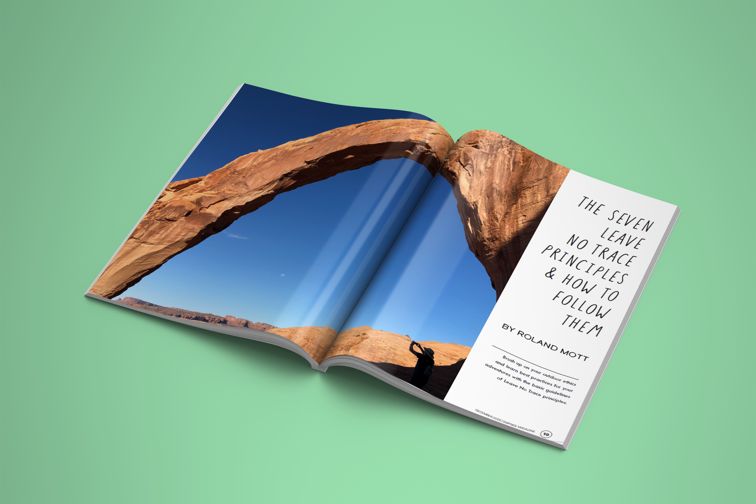
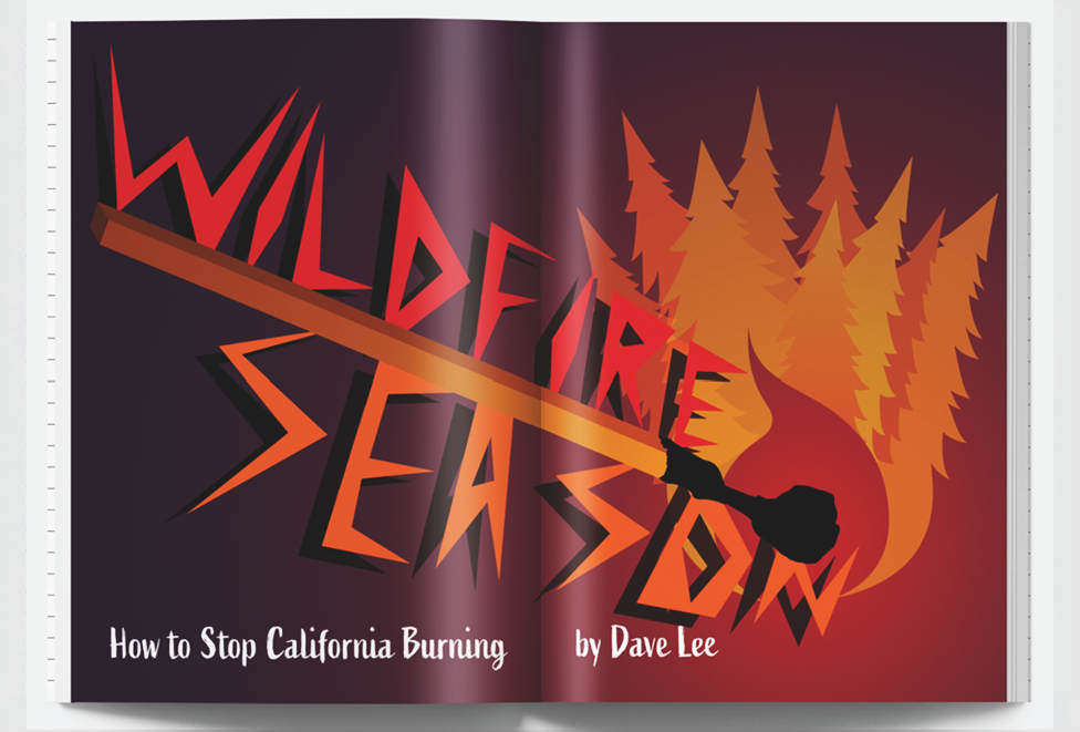
A semester long project during my time at university. I spent 5 months constructing a magazine layout from scratch using original photography and layouts. The content of the magazine is themed around travel within the United States. It focuses on National Parks, and this edition features Southwestern parks in Arizona and Utah. All content in the magazine are original work (illustrations, photography, compositions) excluding the written articles, which have been credited respectively.
This magazine features 60 pages of handcrafted photography, design, and typography, which are divided into 3 separate departments and 3 larger featured articles.
INFLUENCE - My inspiration for this project stems from my love for the outdoors and my time in the Boy Scout program. I went on many camping trips as a boy, including several national parks within California. As I got older I visited parks outside of my home state and had a newfound respect for that land.
AUDIENCE - The audience of this magazine is directed towards newer or intermediate adventurers and travelers wishing to get a more in-depth analysis and advice about the national parks they could potentially visit or are interesting in learning a bit more about than a generic pamphlet or brochure could talk about.
OBJECTIVE - The content of the magazine consists of articles that talk about more personal experiences people have had at these parks rather than just stating the facts. It also interweaves more conservation-minded articles to help travelers stay informed about how to best interact with the nature they are admiring. I wanted this magazine to stray away from the usual reads that other travel magazines tend to follow and create a novel experience for interested minds.
RESEARCH - The research for this project was very methodical and extensive. I only started designing the cover page and title itself about 3 weeks into the project’s initial stages. I had to define an audience, purpose, and message to the magazine; and then find a unique name to the magazine that would fit the theme of the content. All articles within this magazine are from accredited writers who either had experience in the parks or are writing about conservation efforts within nature (names credited at bottom of this page).
LAYOUT - The magazine consists of 3 departments and 3 feature articles. Each one of these sections needed a name and header, after those were established I designed a templated layout for each that would be followed loosely for the duration of that section so readers know where they were within the magazine.
EXECUTION - All photography was taken and placed within the magazine relative to what the article was pertaining to. For example, one of the articles relates to surviving in the outdoors so I took many of the camping related objects that I owned, photographed them in a brightly lit space, and then cut them out to place them around the title page of the article to express the message that you cannot into the wilderness unprepared.
ASSESSMENT - As the first large scale layout and composition project, I believe that this project was mostly a success. I enjoy how I was able to combine the photos I had taken from various trips to national parks and make them feel relevant to the topics at hand and also effectively convey a message to the audience.
FUTURE WORK - If I were to redo this project, I would spend more time with the colors and focal points of some of the pages. I feel the flow is great on most pages but there are a few pages I could’ve done better.
GALLERY
just the designs. nothing else.
Let’s work together.
If you're interested in working together, please fill out this super quick form and tell me about your project scope/deliverables, timeline, and budget! The more detailed the better.
I specialize in branding, motion graphics, and typography design, but feel free to name your request and I can discuss with you about possible solutions/designs.
Thank you!
Tyler


